5 Jaw-Dropping Before and After Kitchen Renovations
At Sundae, we renovate and restore many of the homes we acquire. Whenever we take on a new project, our goal is to remodel the house to like-new condition while maintaining its original character and charm. We strive to provide a beautiful, functional update that offers the new owner a comfortable place to live and makes the original owner proud.
For most people, the kitchen is the heart of the home. It is the gathering place for food, drink, and social congregation. In this article, we’re highlighting five kitchen renovations that demonstrate our commitment to creating an aesthetically-pleasing home design that satisfies the needs of any modern family.
Kitchen #1: Knocking down walls
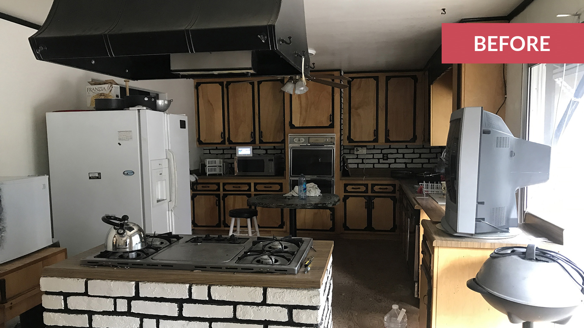
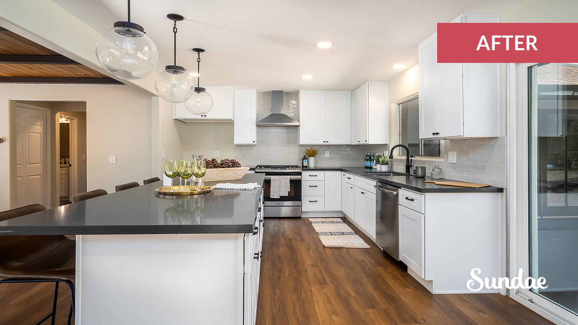
Believe it or not these photos were taken from the exact same angle in the before and after pictures.
We opened up the wall to the left, created a feature range wall with wall-mounted chimney hood, and added a long 8-foot island perfect for entertaining. Bronze fixtures and perfectly spaced lighting really brought this mountain kitchen together.
Pro tip: whenever redesigning a kitchen it is essential to integrate the microwave where possible. Be it a microhood, micro drawer, or built-in microwave we always try to provide buyers with this amenity to free up counter space. In this kitchen, we kept the microwave hidden in the island.
Kitchen #2: Freeing up space
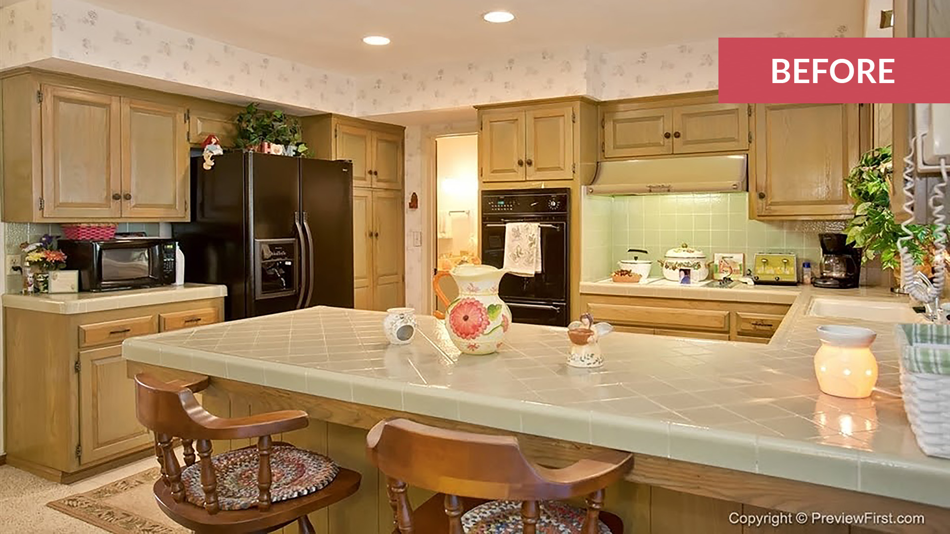
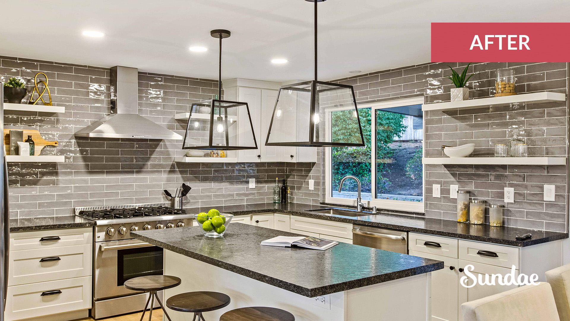
While in decent condition, this kitchen felt dated, squatty, and a bit crammed. We closed up the doorway to nowhere which freed up more counter space, centered the range and island, and added open shelving to create visual interest and save on cabinet costs. The other big change here was raising the soffits. By raising the soffits we are able to take the cabinets to the ceiling, which in turn makes the kitchen feel larger.
Kitchen #3: Extending the room vertically
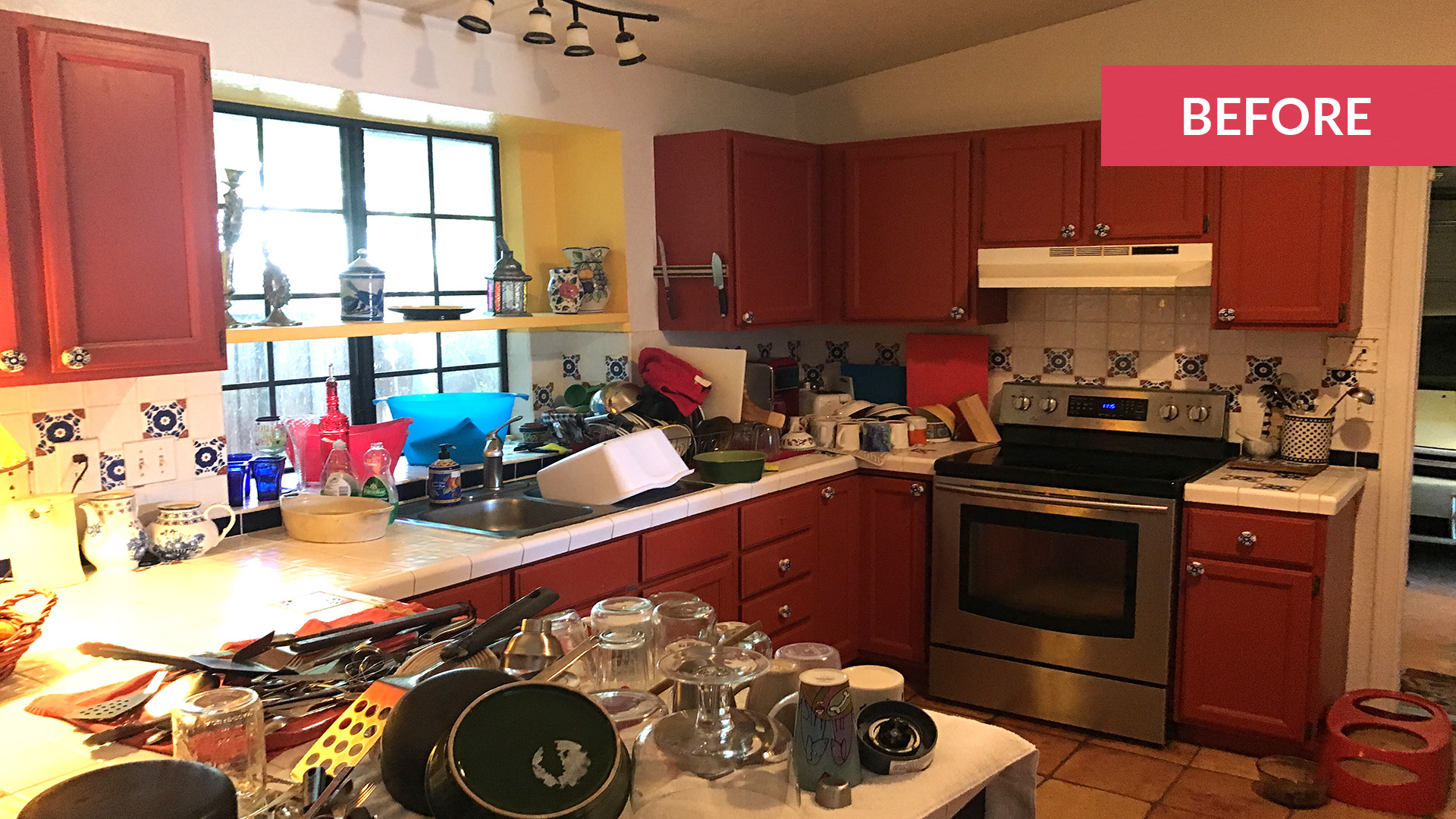
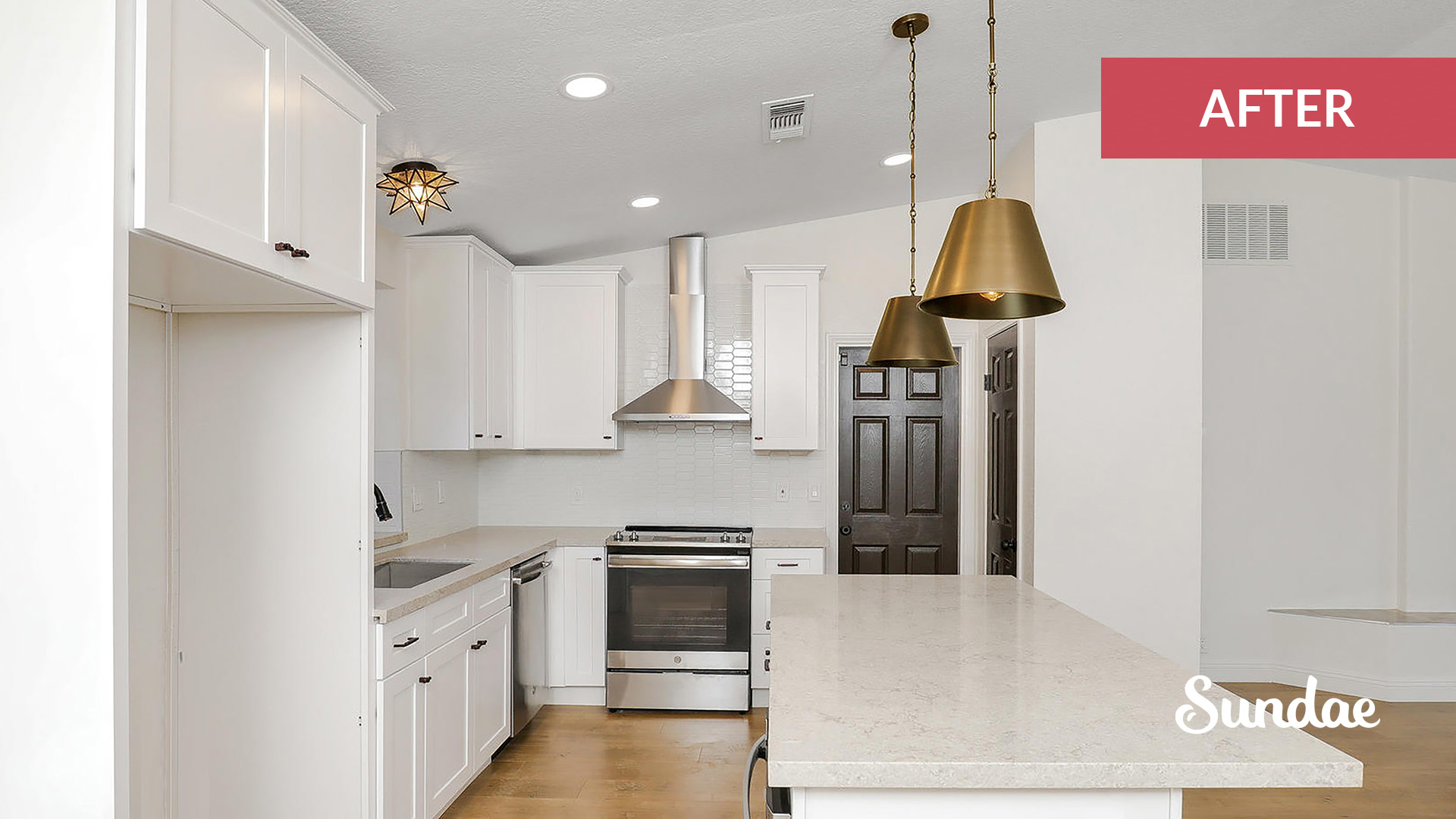
This kitchen was originally boxed in and had upper cabinets that were too small for the ceilings. We opened up the wall adjacent to the living room, installed taller cabinets to make the kitchen feel larger, and added decorative brass pendants to bring it all together.
Kitchen #4: Sunny, SoCal vibes
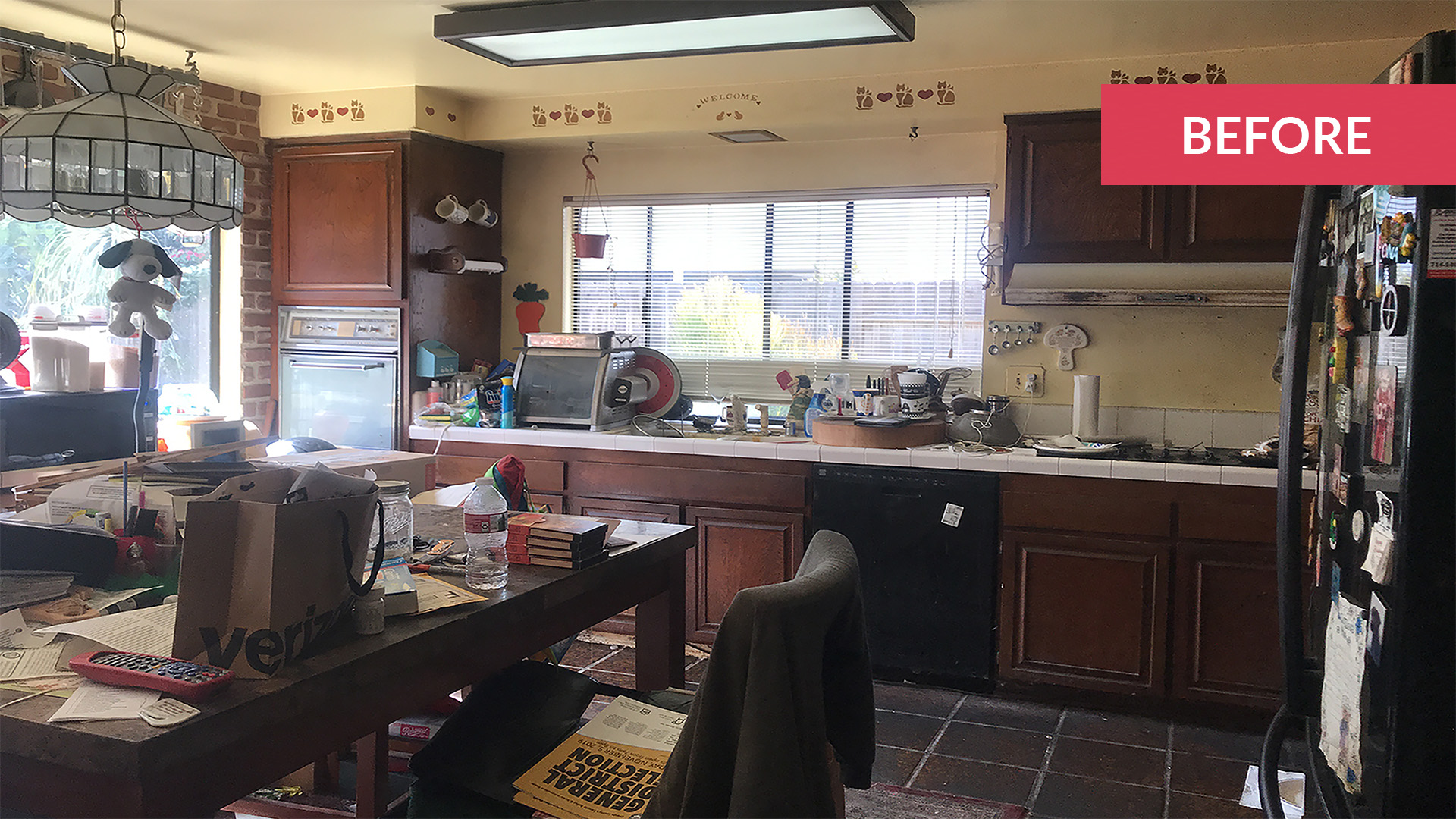
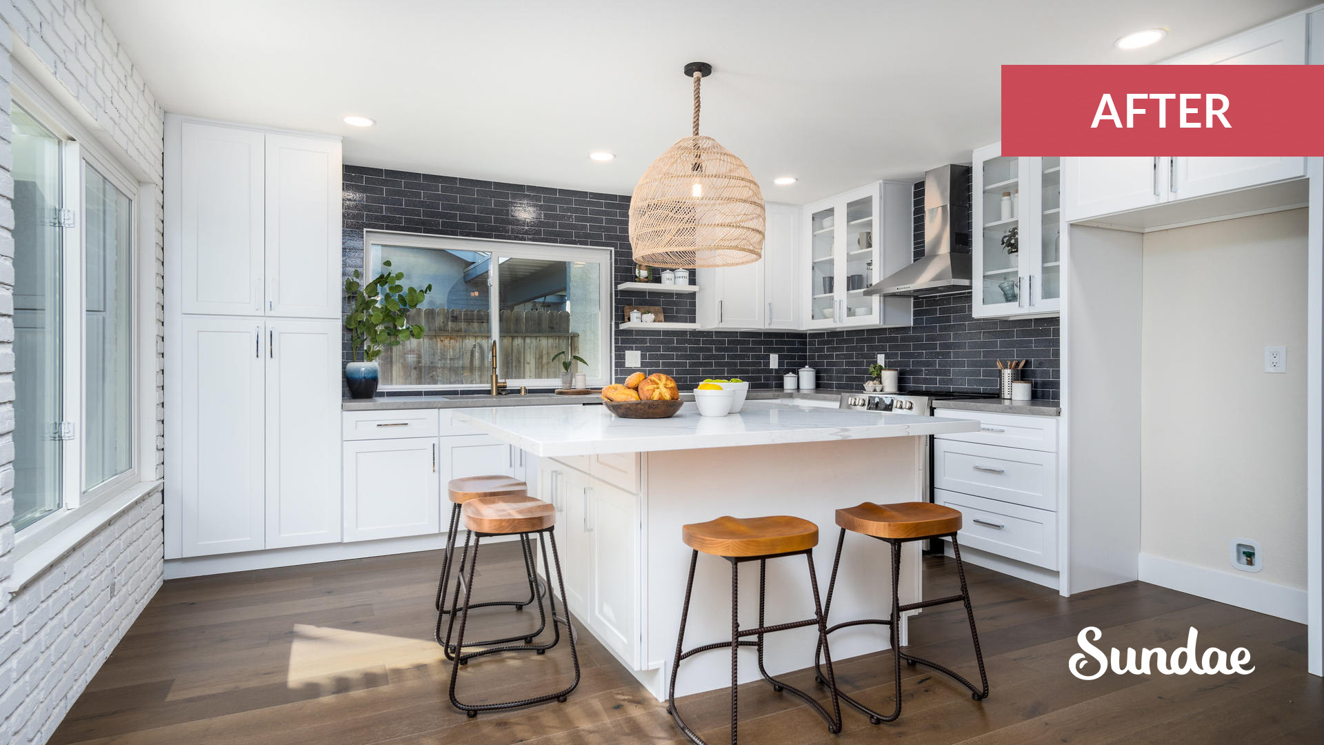
This is a perfect example of a kitchen that already had a great layout, but needed some refining. We centered the range a bit better and added glass uppers for elegance. We also put in a nice big island with ample seating and a hidden microwave.
This home is located in sunny Southern California where the beach culture is big, so we went a bit nautical with the finishes. These included a dark blue backsplash and awesome rattan pendant hanging over the island.
Kitchen #5: Trading fire for water
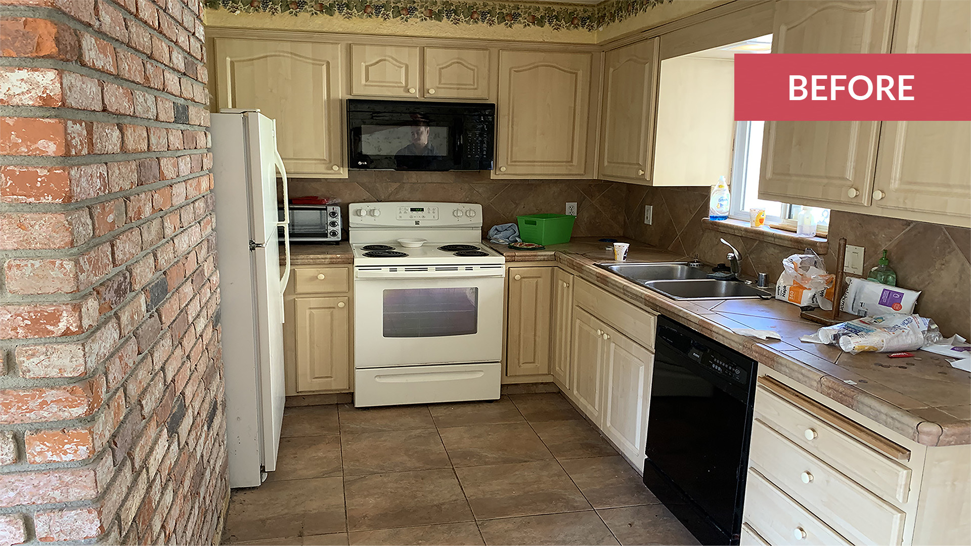
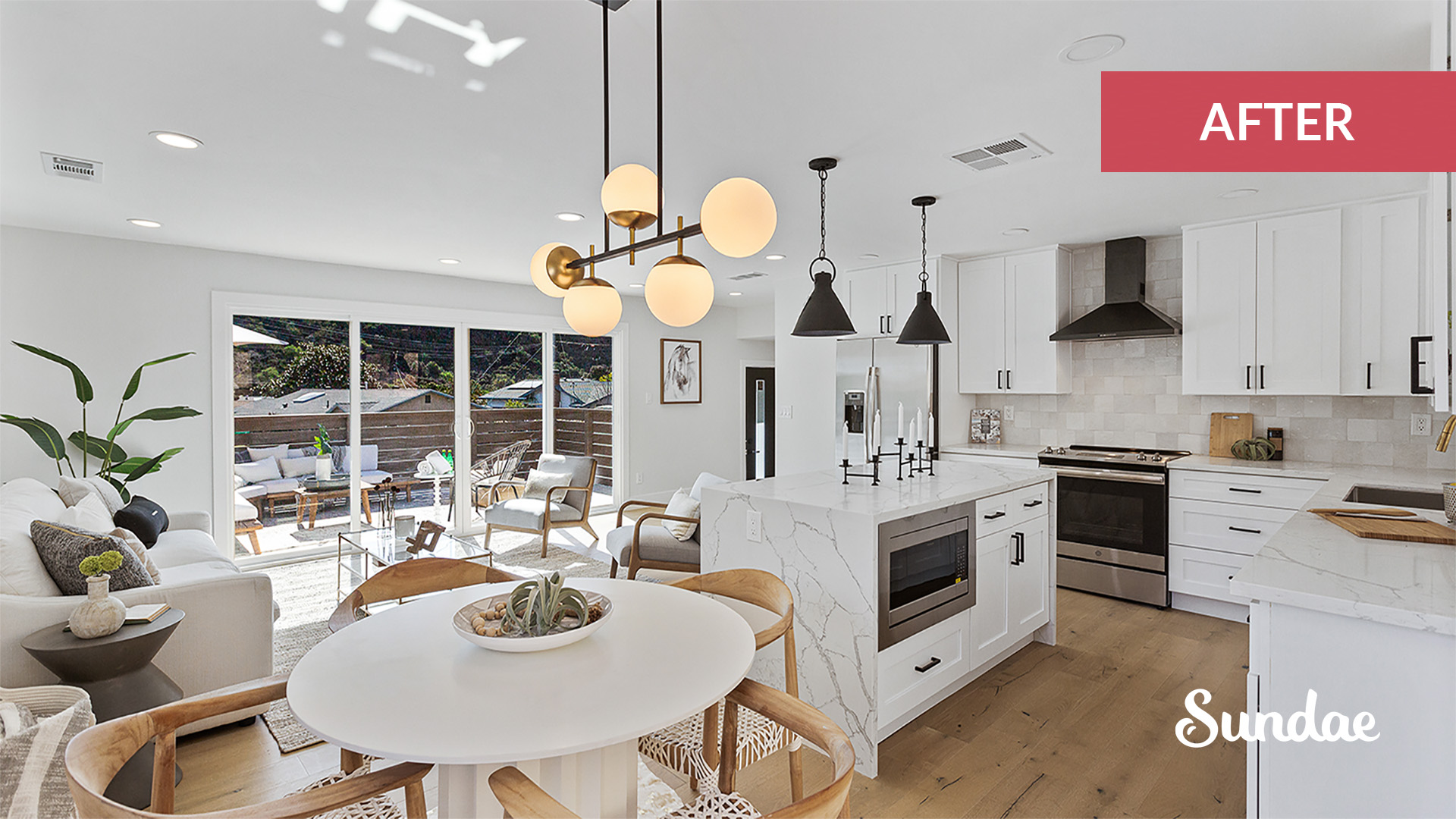
This kitchen got a complete overhaul. What was once a large and bulky fireplace is no longer occupying the lion’s share of the room. We took out the brick fireplace and exchanged it for a gorgeous waterfall island and open concept kitchen. We kept the finishes clean and added contrast with a black range hood. As in kitchen design number two above, by taking up the soffit we gain more cabinet storage and the illusion of a more spacious kitchen.
For more tips and advice on home design and renovation, check out these articles on the Sundae blog:
Ready to Get Started?
Sell as-is. Pay zero fees to Sundae. Move on your time. No repairs, cleanings, or showings.
